Heading
Ever wondered why some logos just resonate with you? It’s not magic; it’s colour psychology playing its tricks.
We’re diving into this technicolour world and spilling the beans on how brand marketing agencies can wield colour like a wizard. Buckle up, and let’s add some hue to your branding knowledge!
Why colour matters in branding
Alright, so colours aren’t just for making your brand look like a rockstar. They play mind games – in a good way! Colours speak to our emotions and influence how we perceive a brand. Your brand colours also form the core of your brand identity.
Take Coca-Cola, for instance. The bold red in their logo screams excitement and energy – just like that fizz when you crack open a can!
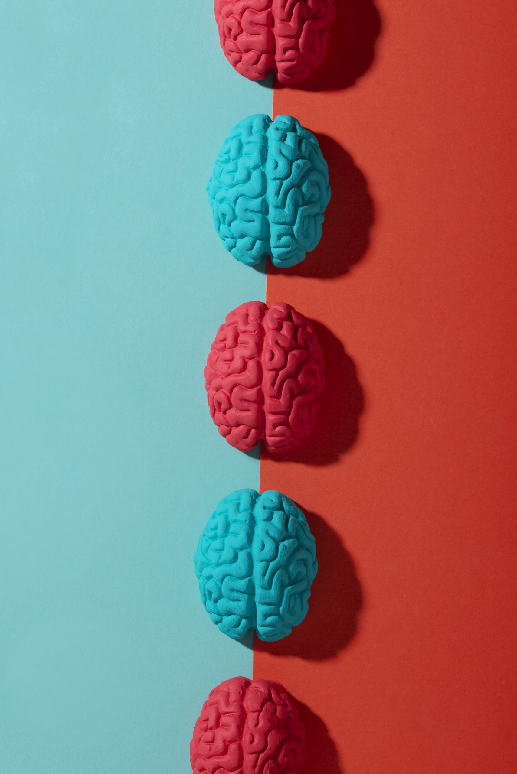
Know your colour dictionary
Colours have their own language, and trust me, you want to be fluent. Here’s a crash course:
Red: Passion, energy, urgency. Brands like McDonald’s use this to make your stomach growl for its fries.
Blue: Trust, reliability, calmness. Facebook uses it to say, “Hey, we’re a trustworthy social hub.”
Green: Nature, growth, freshness. Whole Foods embraces green as if to say, “We’re all about that organic life.”
Consistency is key
Imagine if your playlist shuffled randomly – chaos! Same with your brand’s colours. Netflix keeps it real with its signature red. Whether you’re on their app or website, that red is your constant companion through the binge-watching jungle.
Tailor colours to your audience
Think of your brand like a chameleon. You want to blend in where it matters and stand out where it counts. At a brand marketing agency, If your audience is all about adventure and action, splash some red and orange like GoPro. But if you’re a chill lifestyle brand like Patagonia, greens and blues are your spirit animals.
Tell a story with your colours
Imagine your brand as a comic book – colours are your storyline. They set the mood and narrative. Instagram & Spotify, for instance, use colourful gradients to provide their users with dynamic, creative experiences.
Test, Tweak, Triumph
Don’t settle for “good enough”. A/B test your colours like a mad scientist. HubSpot is a pro at this. They’ve tested everything, right down to their CTA button colours, and know what gets their audience clicking.
Updated trends at the brand marketing agency
Just like your wardrobe, your brand’s colour palette needs a refresh now and then. Stay updated with the trends.
Apple does this impeccably – their sleek, minimalist designs and subtle colour shifts keep them on the cutting edge.
In a nutshell
Colour isn’t just decoration; it’s the soul of your brand. As a brand marketing agency, you’ve got the power to harness this psychology and colour any way you want to. Play around, test the waters, and remember, your brand’s colours are your signature dance moves in this marketing party.


-compressed.jpg)